Building on what you've learned in the 3-color and broadband X-ray tutorials, it is now time to put your skills to the test combining data from different wavelengths into composite color images of our beautiful universe. In this section we'll look at the Pinwheel Galaxy (M101) in X-ray, Ultraviolet, Optical, and Infrared wavelengths as an example of how we pull together data from different telescopes to create our multiwavelength composite images. The multiwavelength datasets that we provide, though in FITS format, have already been processed for press release and are perfectly aligned, so very little intensity scaling, alignment or image smoothing will be necessary in this section to produce stunning images. You simply decide the color palette and pull the images toegehter in your favorite image processing platform. For datasets that include 3 color images (optical or infrared for example) as a part of the composite, the file names imply the colors that should be used (i.e. optical_R, optical_G, optical_B). When you're done with the tutorial, click here for more data!
Tutorial 3: M101 Great Observatories
- Download data (right click -> Save As): M101 Great Obsevatories Images:
- Open files in GIMP and Switch to RGB
- Use File->Open as Layers... and select the three files you just downloaded
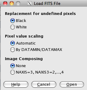
- Note that the default parameters in the "Load FITS File" dialog box should work well for this example
- You should see 4 layers in the Layers box; the layer names correspond to the file names.
- You can rename the layers if you want, but the file names are descriptive enough to keep track of them.
- The images you've opened are Grayscale and will need to be changed to RGB in order to colorize the layers. Do this by clicking on Image->Mode->RGB.
- Change Each Layer Mode to Screen
- When you first open the files in layers, only the topmost layer, in this case M101 IR, is visible. You need to adjust the Layer Mode to allow each layer to blend together.
- The screen mode applies a function to each pixel of each layer in your image. That function subtracts 255 from each pixel, multiplies multiple layers of pixels together, divides by 255, and then subtracts 255 from the resulting value. The new image is a linear combination of the pixels in each layer.
- You can activate screen mode for each layer by selecting the layer in the Layers dialog box, and then clicking on the "Mode:" drop down menu and selecting screen.
- Do this for each layer, and you'll notice the image brightening as you go.
- Adjust Levels
- As mentioned in the introduction, the files we've supplied have already been processed for press release so any level adjustments are a matter of personal preference. For reference, here are the steps to perform levels adjustment with GIMP.
- Start with the topmost layer, and turn off the layers under it by clicking on the eye icon to the left of the other layers.
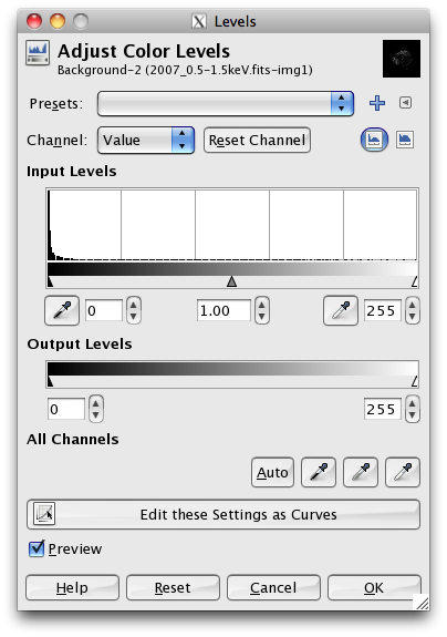
- Open the Levels dialog box by selecting Colors->Levels and feel free to adjust the small triangles under the histogram plot in "Input Levels" to your liking.
- One would typically only adjust the gamma of each layer by only adjusting the middle slider to the left or right depending on how you want to adjust the level.
- Repeat this process for the remaining two layers until you are comfortable with the results.
- The trick with adjusting the levels at this stage is to bring out faint details in the object but minimize the amount of background "noise" in the image. Play around with the sliders and see how subtle changes in the levels affect the image.
- Add a Splash of Color!
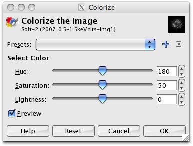
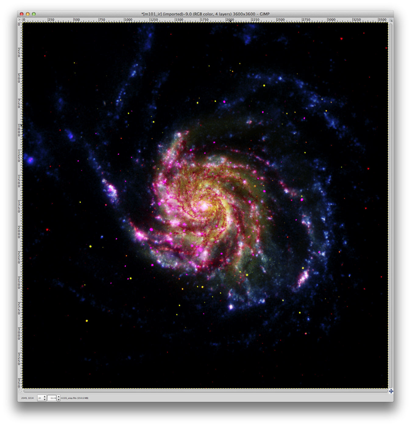
- To apply color to your layers, we'll work from the bottom up starting with the Spitzer Infrared layer. Select this layer, and then go to Colors->Colorize. In this example we'll be coloring IR->Red, Optical->Yellow, UV->Blue, and X-ray->Magenta. So, for this layer, we'll want to make it red.
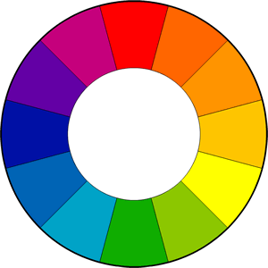
- You'll notice that as you sweep the Hue bar from left to right, the numbers increase from 0 to 360. That is because Hue is pulled directly from the color wheel; a 360 degree representation of the visible light spectrum (red, orange, yellow, green, blue, violet). Imagine that you've taken the 360 degree color wheel and layed it out as a flat strip on a table. Now, you're selecting colors by specifying the location on that strip in degrees. The color red just happens to correspond to 0 degrees on the color wheel, hence 0 in the Hue selector.
- In order to have a rich color that doesn't over saturate when you combine with the other layers, we'll use a "Saturation" value of 100 combined with a "Lightness" value of -50
- For the other layers, try various Hue settings to find your ideal colors, and combine that with the recommended Saturation and Lightness levels.
- You may want to turn off the layers that you're not working with in order to clearly see the color effect you're applying.
- Provided you've followed the suggested color mappings, you should end up with something similar to the image below.
- The Finishing Touches
- Now that we've added color to the image, it is really starting to come together. As mentioned in the introduction, once you've colorized the layers, you've essentially recreated a Chandra press release image!
- At this point, you can let some creative freedom loose and explore various tools within GIMP to bring out more of the color and brighten the image up.
- When you're satisfied with the individual layers, use Image->Merge Visible Layers to flatten your image. You could then, for example, use the "Curves" tool in "Colors->Curves" to emphasize the saturation of the brightest levels in the image, while slightly suppressing the lowest levels to make the image "pop".

- See the Chandra Education page
- Creating 3-color images using SAO DS9
- Detailed information about Chandra's data flow

